Lucideon
Lucideon is a materials science consultancy, solving its clients’ most complex challenges through materials development, process optimisation and characterisation. It utilises its many years of experience in development, analysis and assurance to provide technical consultancy to enable, enhance, and accelerate its clients’ R&D activities.
Lucideon has clients from various industry sectors around the world, including Aerospace & Defence, Ceramics, Construction, Energy, and Healthcare.
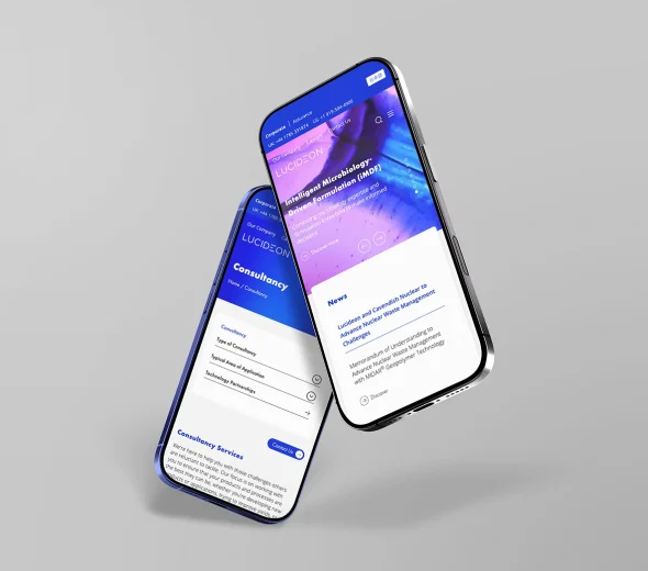
A new website design to match Lucideon’s professional expertise
Lucideon commissioned Plinkfizz to deliver a new website design. Their original website had become hard to navigate, with far too many pages to be effective.
The replacement website is designed to showcase Lucideon’s expertise in a clean, user-friendly channel that is easy to navigate.
The design of the website included de-cluttering content pages, introducing “stories” as a communication device, enhancing the navigability of the site, implementing smart filtering and making huge improvements to the design and imagery.


95% user satisfaction for the new website
Following the launch of the website,
it was launched to a global audience.
36%
Reduction in the number of pages on the website.
17%
Increase in average visitor duration.
95%
of users think new website design is excellent or good.
Lucideon was happy with the new website, stating that they loved:
- The huge improvements that were made to the design and the imagery
- The introduction of “stories” (with their video previews on the home page carousel)
- The enhanced user friendliness of the site
- The content decluttering process, and the simplification of the website from by removing the cumbersome industry sector microsites
- The ‘smart’ filtering system for the Testing & Characterisation menu


